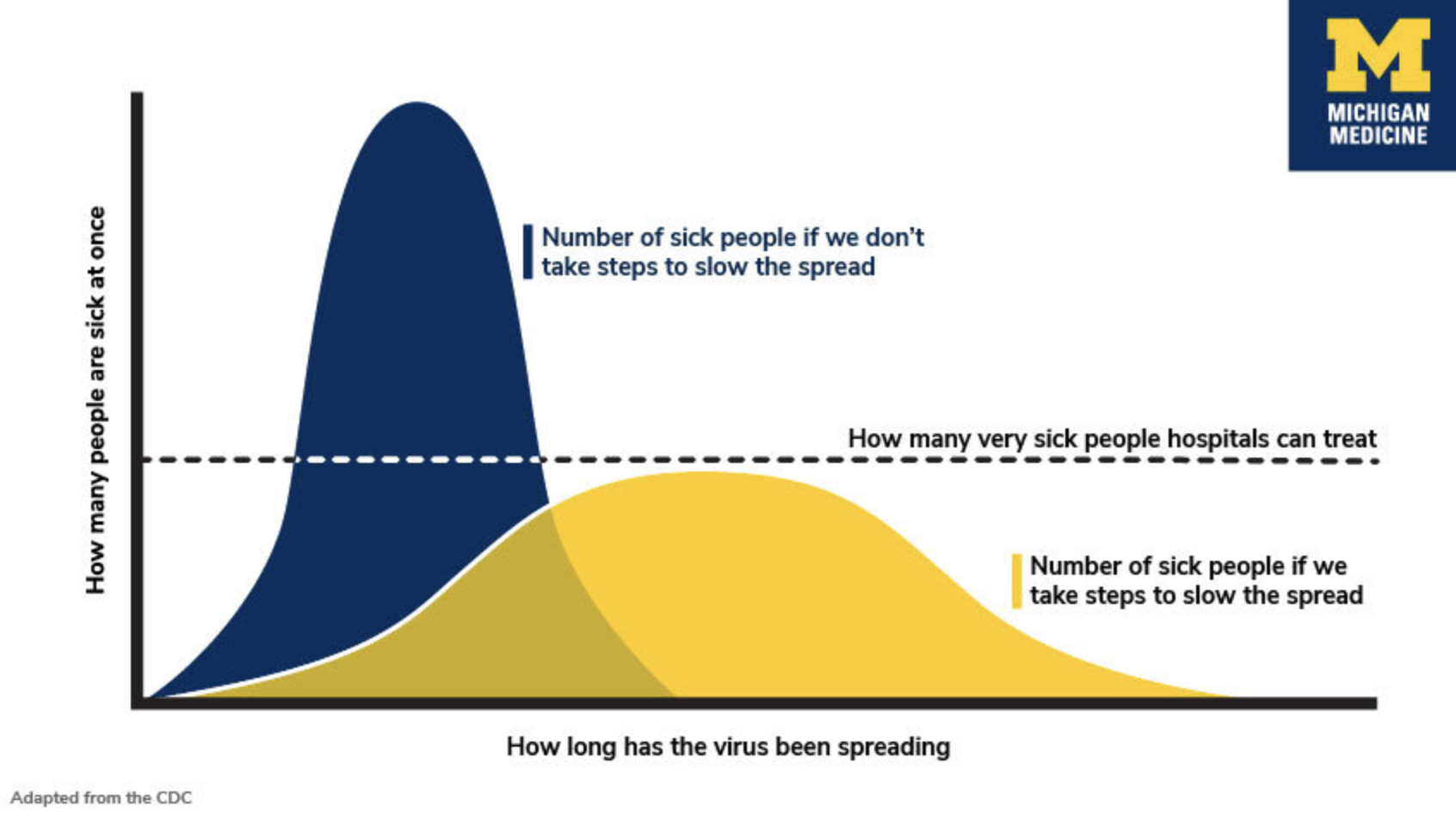
The notion of “flattening the curve” has become the popular way that people have come to understand quarantine measures. The idea is that the curve depicting coronavirus infections is rising sharply, but that if we socially distance and quarantine ourselves, we can flatten the peak of that curve and prevent the medical system from being overwhelmed.
But this idea is being plotted in two different ways: linearly and logarithmically. Logarithmic graphs make more sense for exponential curves like coronavirus cases and deaths, but they also must also be read differently than linear graphs.
In the early narratives, the “curve” depicted the number of cases versus time, presented on linear scales. The height of each point on this curve simply reflects something like the number of new cases per day. A peak twice as high represents twice as many cases.
In a worst case scenario, the curve jumps up sharply, beyond the medical system’s capacity, and then drops down just as quickly as the virus runs out of new people to infect. With social distancing, people can’t get infected as fast, reducing the height of the curve at its peak, albeit stretching it longer in time, as the population takes longer to develop immunity. “Flatten the curve” as most commonly been associated with these graphs, which look like this:

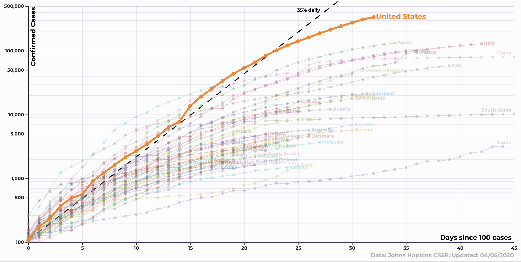
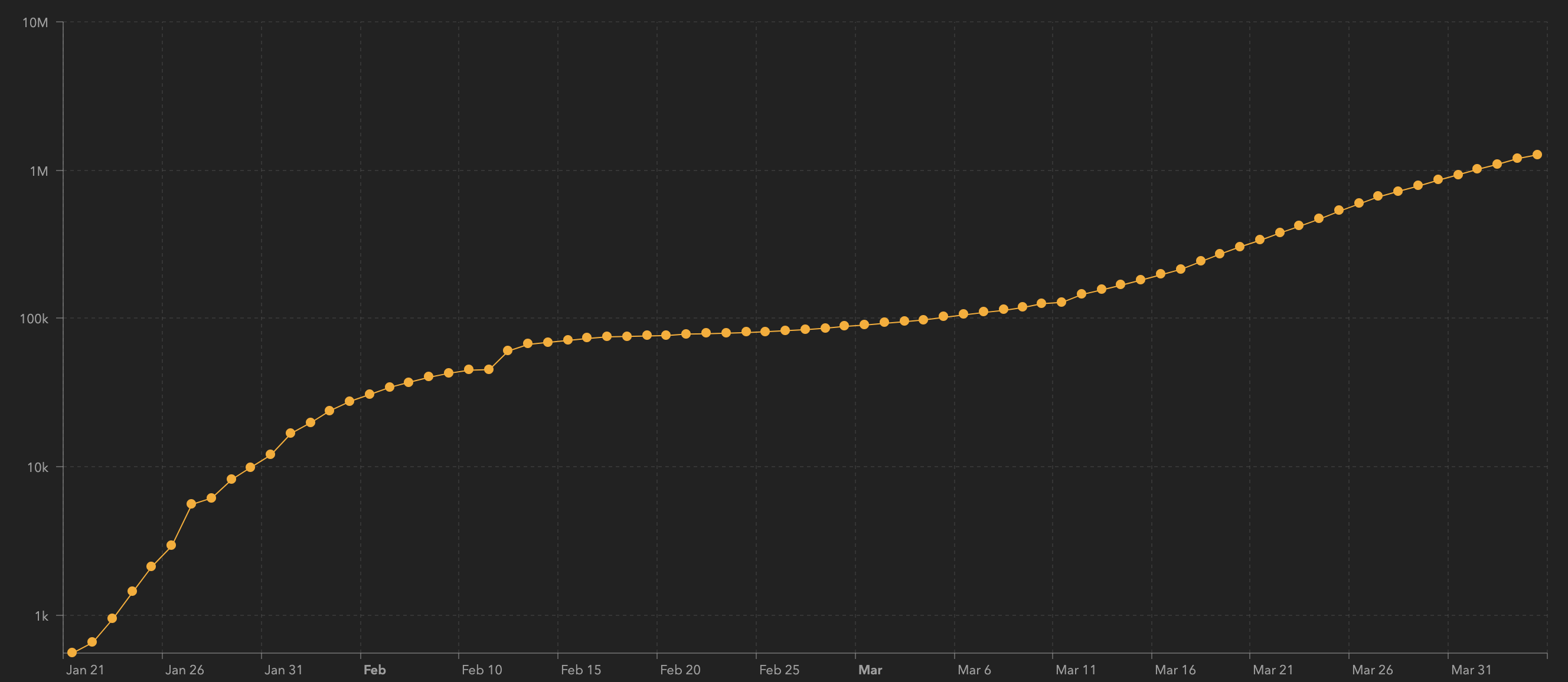
But more recently, different, logarithmic graphs have become more widely shared. These curves, being plotted on popular graphs by the 91-Divoc and Johns Hopkins University, use logarithmic (log) scales, which reflect exponential growth over longer periods of time. These curves represent a totally different measurement: the cumulative number of deaths versus time. Because deaths and number of cases are a fixed number (dead people cannot come back to life; if you're infected with coronavirus, you will still have had it even if you recover), as the chart moves right along the x-axis, the point plotted on the vertical axis will never decrease.
The important thing to note about log plots (specifically, log-linear plots, where the y-axis is logarithmic and the x-axis is linear) is that the log scale is not linear, meaning the height of a point on a curve is not directly proportional to its value along the vertical axis. The values on the scale go up exponentially with increasing height, by orders of magnitude—factors of 10.
For example, here's what a logarithmic coronavirus graph looks like:

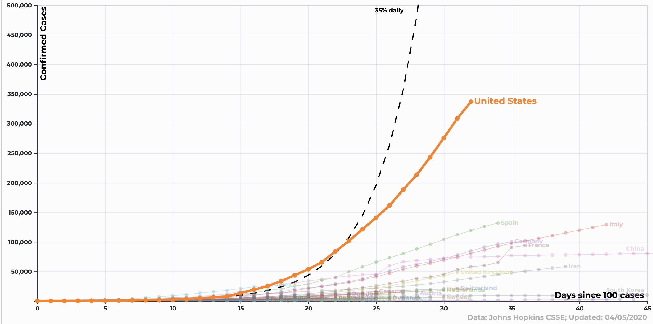
And here's what that same data looks like on a linear graph:

Exponential behavior is fundamental in mathematics and science. Early on in the disease spreading timeline, exponentials pop up in everything, most notably illnesses and deaths.
The easiest way to think about an exponential growth of something like infections is to imagine the number of infections constantly doubling. Intuitively, what happens is that each infected person carries their infection to someone new, so the more infections you have, the faster the rate of infection. Exponential growth can go incredibly fast.
Quantities that grow exponentially, when depicted on a linear scale, look like curves that bend sharply upward, with the curve getting constantly steeper. On a log scale, exponentially growing values can be depicted with straight diagonal lines.
That’s the beauty of plotting things on log scales. Plots are meant to make things easy to understand, and we humans are much more adept at understanding linear, straight-line behavior. Log plots enable us to grasp exponential behavior by transferring the complexity of constantly steepening curves into the simplicity of an exponentially increasing scale.

The issue, though, is that if you aren’t used to looking at logarithmic plots and don’t pay close attention to the scales, you might think that deaths are leveling off or slowing down, while they’re still increasing exponentially.
Either on a log plot or a linear plot, the curve for the total number of deaths will never go down, since people can't come back to life. To flatten the curve of the total number of deaths, all you can do is make the rising curve trend more and more horizontal.
But on a log scale, this flattening of the curve can be misleading. If the curve is ever straight diagonal, no matter how small the slope (the angle it makes above horizontal), then it still reflects exponential growth in the number of deaths. It can look like the curve is mostly flat, but because the scale is so drastic, huge numbers of deaths can still be occurring.
On a log scale, we want to constantly be making the line more and more horizontal. The general concept of “flattening” is still a good one, but it’s never going to curve down.
from VICE https://ift.tt/2Vn1wiD
via cheap web hosting
No comments:
Post a Comment